This slideshow shares good practices to follow in designing research posters.
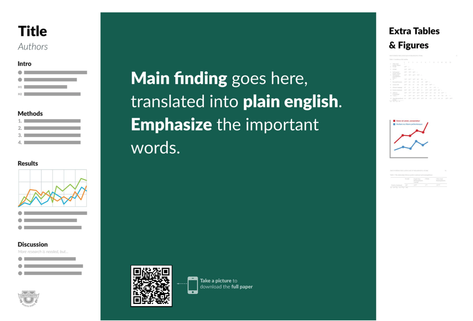
Alternative research poster design schemas are making inroads into conferences. The #betterposter theme, by Mike Morrison, emphasizes very large findings and significantly reduced text and data. Remember that your poster is not a full paper -- it's a summary meant to foster conversation.

Criticisms of the #betterposter theme have been posed -- does it go too far?
